
“Headspace” is a series that I deem to be a personal artistic breakthrough. The creation of the series was rich with new discovery as I finally found the balance I needed in terms of scale, application of paint and color palette. I feel led to share my thoughts on the process and my overall reaction to this series.
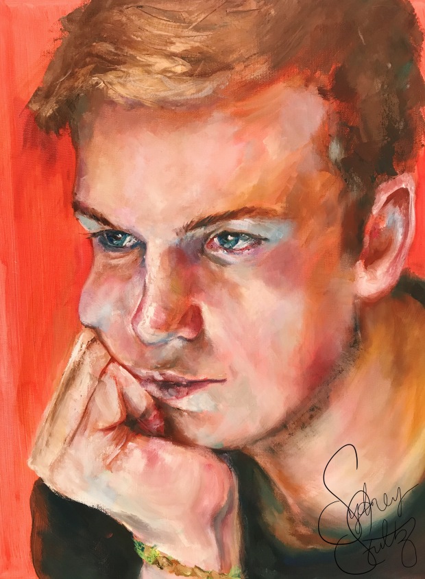
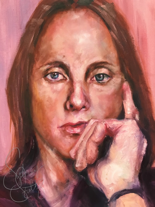
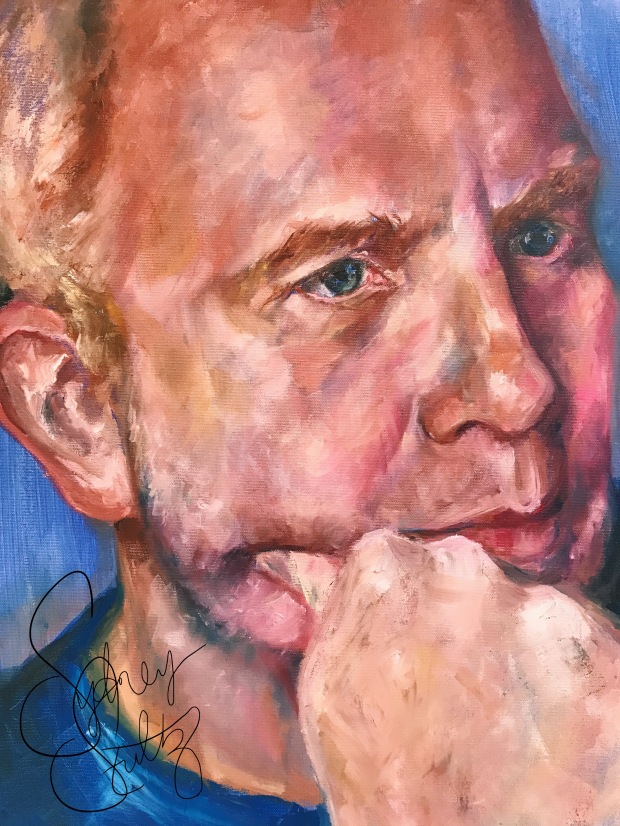
First, to address the subject matter. The series was part of my Advanced Painting course, and I found myself exiting a series that involved the recycling of old family photos as subject matter. I dedicated a couple months to this idea of reshaping the past and frankly, I grew tired of it. So, as I approached Series 2, I knew I needed to be selective in subject matter and choose something that would re-energize my portraiture – something based more in the present. To be honest, I chose my family (brother, mom and dad) because they are always around me and it was convenient to photograph them as models, but I did not expect this decision to impact the work as it did.
Painting people who you interact with on a daily basis really makes a huge difference in the creative process, at least in my case. I have seen their mannerisms, memorized their unique features and could probably pick out their voice in a crowd. These connections simply strengthened my ability to capture their essence – the reference photos acting as training wheels and not the entire bike. A lot of the decisions I made were instinctual because it was muscle memory. I really felt my hand being guided as I built up these compositons. These were not painted from life, but in some way, I felt like I had the same experience as working from life.
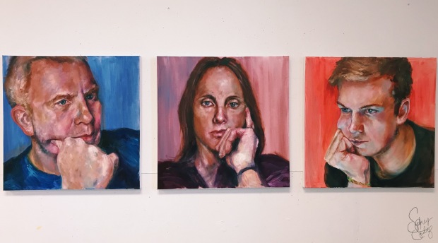
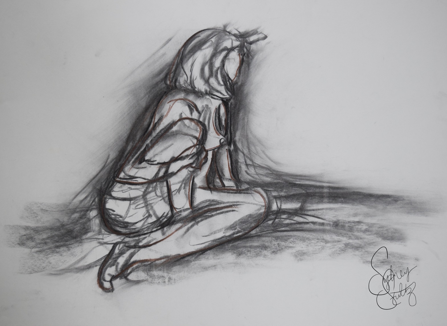
The pose of each model was rooted in the analysis of a person’s thinking process. It is common to lean on or use your hand in some way when you are deep in thought. I noticed this pattern in each subject, so I decided to use it as a motif for the series. I really do see these paintings as psychological portraits – hence the title of “Headspace.” They are vulnerable in their proximity to the viewer. Each head extends beyond the border of the canvas, which sacrifices the privacy of each subject.
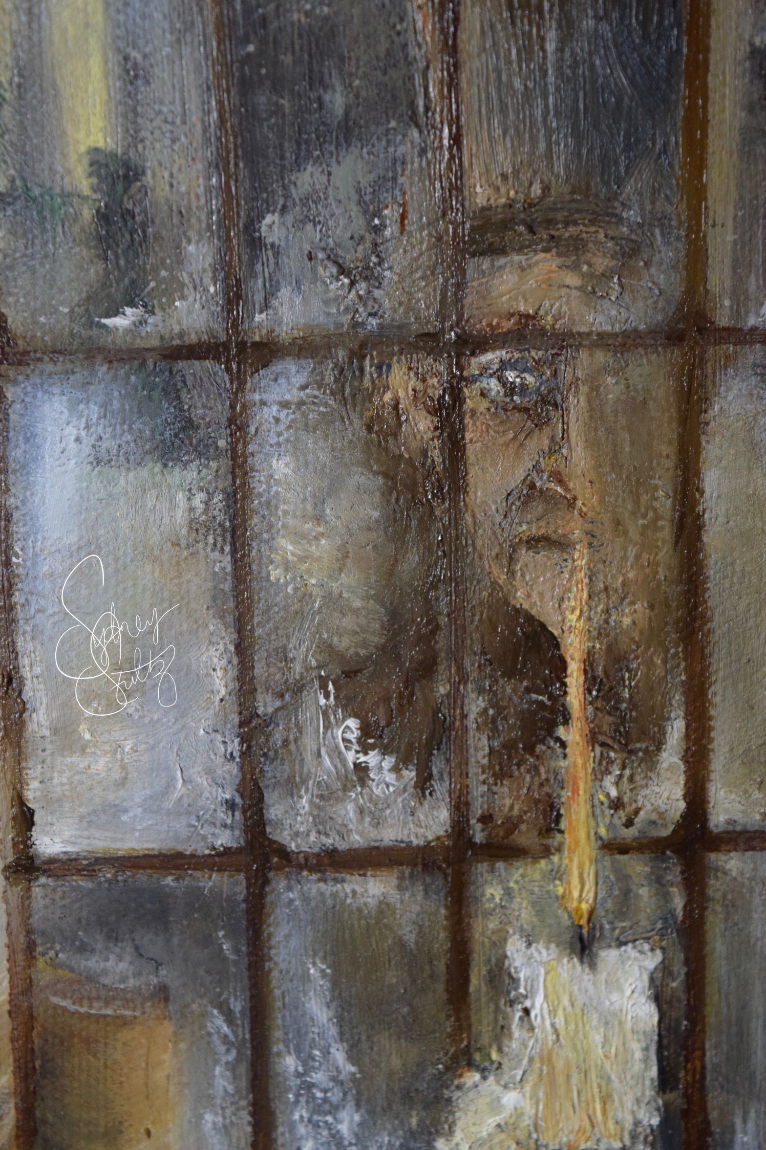
As for techniques, this series was a major breakthrough. I finally understand how I operate as a painter! I landed on a process that felt right and true to myself. I used Gamsol to thin the paint, but only for the base layers. Once I reached the 2nd or 3rd layer, I switched to pure oil paint – no solvents, no mediums. The paint was tacky and allowed me to really build up and layer the paint without it all running together and becoming muddy. I was able to preserve the pure hue of each color. This concept of pure color was a motif throughout my process. I worked in a way that would place vibrant hues next to each other (or layered once the base was dried) so as not to compromise the authenticity of my color palette. The vivid saturation allowed the portraits to really breathe life.
I discovered my love for flats and brights. I only (for the most part) use these flat brushes to build up the planes on the faces. This angular style of applying the paint was revelational. I finally found a rhythm to my brushwork leaving behind my days of blending for a more geometrical approach.
The background shades were intentional. Ian’s portrait started with this vibrant pink shade, completely by chance, and I really grew to love it. This color kept seeping through the oil paint and flashes of it would reappear throughout the portrait, bringing it to life. I knew I had to reuse this method in the other two paintings. The series as a whole creates a gradient as the background colors, which influence the overall tone of the portrait, begin with a rich blue, fade to a purple and then end with the bright pink.
Within my color palette, I found the power of quinacridone red and manganese blue. These played a significant role in how I created the flesh tones. Most people do not realize the variety of color that is found in flesh; blues, greens, yellows, purples – they are all there. But, the purples and blues really changed the game for me and I tried to emphasize them.
I have to credit the artist, Colin Davidson, who was a major inspiration for this entire series. I kept referencing his technique of rugged and aggressive paint application (lots of palette knife!). I believe this research was the reason for these new discoveries. He has this beautiful way of fully rendering and blending the paint of the eyes while keeping the rest of the portrait active and textured. This is a tactic that allows the viewer to rest with the eyes, to pause, and make the human connection. I applaud Davidson’s work and will always be a supporter and admirer.
My main reason for writing this post was simply to document my thoughts on this process before they leave my mind, but I doubt I will ever forget this series. These three paintings are my proudest works thus far.
If you have reached this point, I appreciate you taking the time to read my analysis of this experience. I hope to continue making portraits that compete with, and hopefully exceed, “Headspace.” I must say, paint continues to amaze me. I know I will learn more of its nature for years to come, but I am always grateful for the lessons art has taught me and continues to teach me – not just in a physical sense, but historically, culturally and spiritually.
Sydney Stultz